Litrato.co
Brand identity
Litrato.co is an online initiative that aims to discover, promote and celebrate genuine talent for outstanding documentary and fine art photography in Asia. The platform will feature well curated online exhibitions and an emerging artists collections programme. Litrato aims to be an innovative showcase and art collection experience.
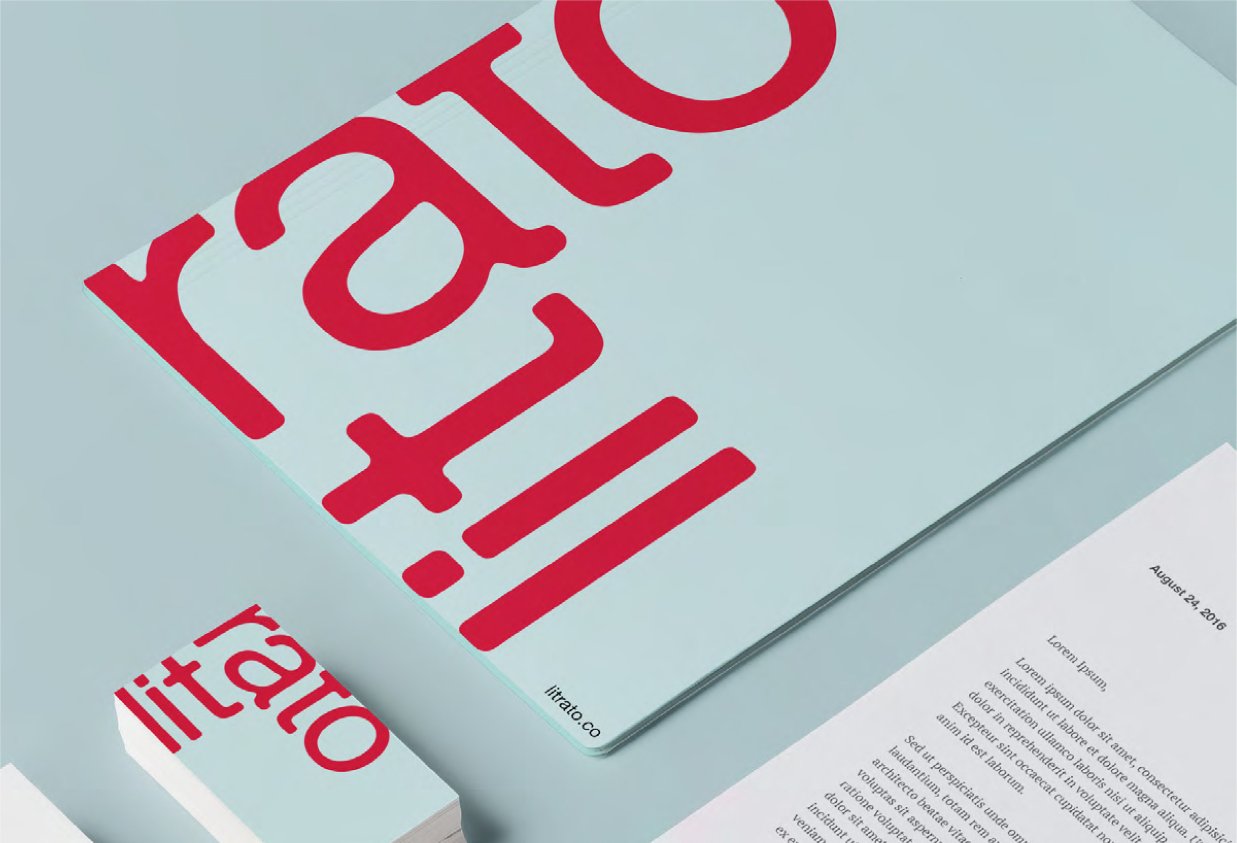
The client requested that the logo be a symbol of a unifying agent or a shared platform; not spiritual. It needed to be simple, bold and modern—no heavy artwork as we needed the focus to be on the photography itself. Hence, a straightforward typographical solution that alludes to the framelines in a camera’s viewfinder. It is minimal—a subdued mark—and can step aside to the edges of a canvas in order to make the actual photo shine. Yet, at the same time, it is dynamic enough to be bold and stand on its own, front and center.
The inspiration (keywords: frames, perspective, focus)

The logo
The Litrato logo can be rotated on any side and used as an accent on any corner of a document.
Applications: